Why Your Logo Can’t Be Your Brand
Did you know that your brand is not just your logo? I think many times you’ve heard people say this but have you heard much about why?
GRAPHIC DESIGN TIPSBRAND DESIGN
Liz Trujillo
2/16/20233 min read
To begin with we have to define what a brand is. Simply put, it is what your customers feel and thinks about you. This is generated unconsciously thanks to the combination of several graphic elements, such as logo, typography, color palette, and tone of communication (the language your brand uses).
Your brand communicates ideas with all these elements working together.
So the logo is really one more piece of your brand. The logo is the graphic that will be your first impression for your future customers. That is why it is important that your logo is dynamic and original. I would say that its shape needs to be unique so it can be recognizable in any possible medium as the brands below:
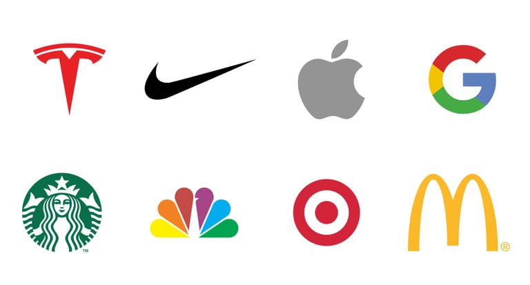
Top 8 famous logos: Tesla, Nike, Apple, Google, Starbucks, NBC, Target, and McDonald’s.
As we see in the example before, there are figures or silhouettes that you know their name and what they stand for without needing to read their names.
Now let’s talk about colors. Colors are a huge impact as a communication tool. If you think about Starbucks you will imagine the logo and the color green, but if I put red and blue on their logo your brain immediately will tell you that what you are seeing is not Starbucks even tho the shapes are the same.

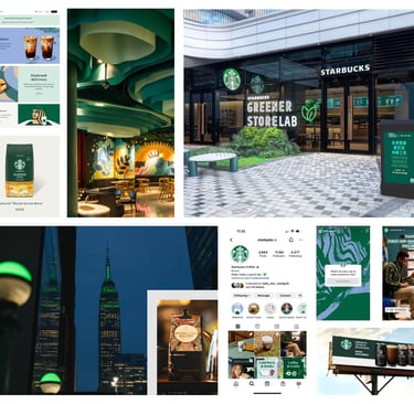
These are some graphic pieces and physical stores where you can see the importance of using Starbucks’ brand color palette.
Now you can feel and see the impact color has.
Have you ever wondered how brands choose their colors? It’s a whole process, sometimes you can draw on color psychology and other times may use that knowledge as something disruptive. If you want my help choosing the colors for your brand you can sign up here for my workshop on how to create your color palette.
So now we know that colors are essential. What about typography? In this case, we have to know about the main 4 categories of typefaces: serif, sans-serif, script, and display fonts.
Serifs are identified by extra marks at the end of letters (called serifs), there are often used when a brand is more formal while sans-serifs are used for more informal or minimalist brands. The scrip category mimics a handwriting style, some of them might look looser and more retro. Lastly, the display fonts are highly decorated versions of all the above-mentioned categories, the point of using a display font is to grab attention with a unique look. This means each typography communicates differently:
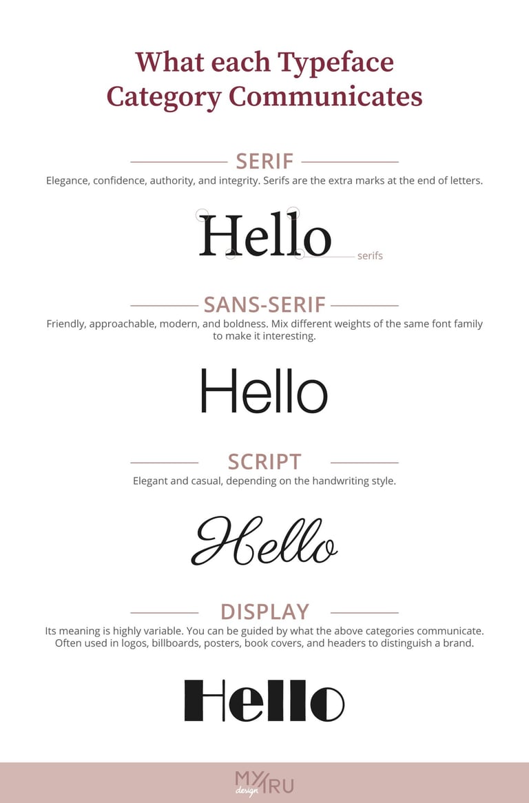

Fonts are a powerful part of designing a brand because they can transmit energy and personality. There are millions of typefaces you can find online and knowing about these 4 main categories will make the selection process easier.
Finally, we have the tone of communication (your brand’s voice). Here we are referring strictly to how you bran talks. Is it informal or more casual? What kind of relationship do you want with your customer?
Let’s see an example: these are the Windows vs. Apple communication tones:
These are the 4 main categories of typefaces.
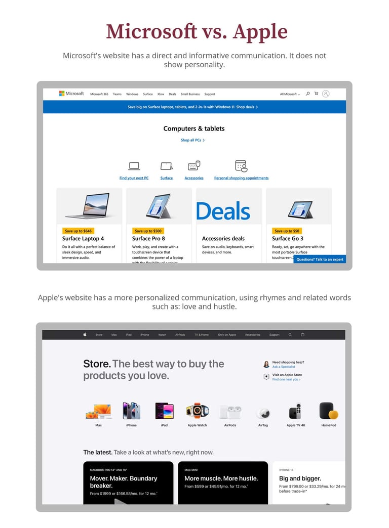
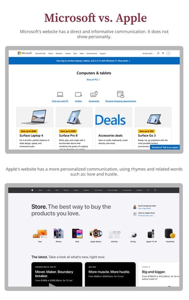
You can notice how the approach of each brand when they are writing their blogs, social media ads, and website.
In conclusion, the logo, color palette, typography, and tone of communication play an essential role in building and designing a brand. This is how you will have a whole identity system that helps you to stand out and attract the attention of your ideal customer. Therefore when you are starting a business and you want to take it to the next level, what you really need instead of a “nice logo” is a brand identity.
You can grab here your cheat sheet on 5 Tips to Build Your Brand Identity to put them into practice! And, if you have any questions leave them in the comments or write me on Instagram.
Both are technology brands but have different communication tones.
CONTACT
liz@mytrudesign.com
ADDRESS
Operating worldwide, based in Quito, Ecuador
© 2024–2026 Mytrudesign. All rights reserved.