
The Secret to a Winning Color Palette
GRAPHIC DESIGN TIPS
Liz Trujillo
3/19/20254 min read
Have you ever looked at a brand and instantly felt connected? That’s the magic of a well-crafted color palette! Colors play a huge role in shaping how people feel about your business, and choosing the right ones can set the perfect tone for your brand.
Why Color Matters in Branding
Colors aren’t just for decoration—they tell a story. They create emotions, influence decisions, and help your brand stand out. Think about the calming blues of a wellness brand or the bold reds of a fast-food chain. These choices aren’t random, they’re strategic! And we have all been influenced by this. Now let's talk about how you can create a winning color palette.
How to Create a Winning Color Palette
Trust me, I’ve created hundreds of color palettes for all kinds of brands, and I always keep these tips in mind when putting them together. If you want your brand to really connect with your audience, here’s the secret to picking the perfect colors:
1. Start with Your Brand’s Personality
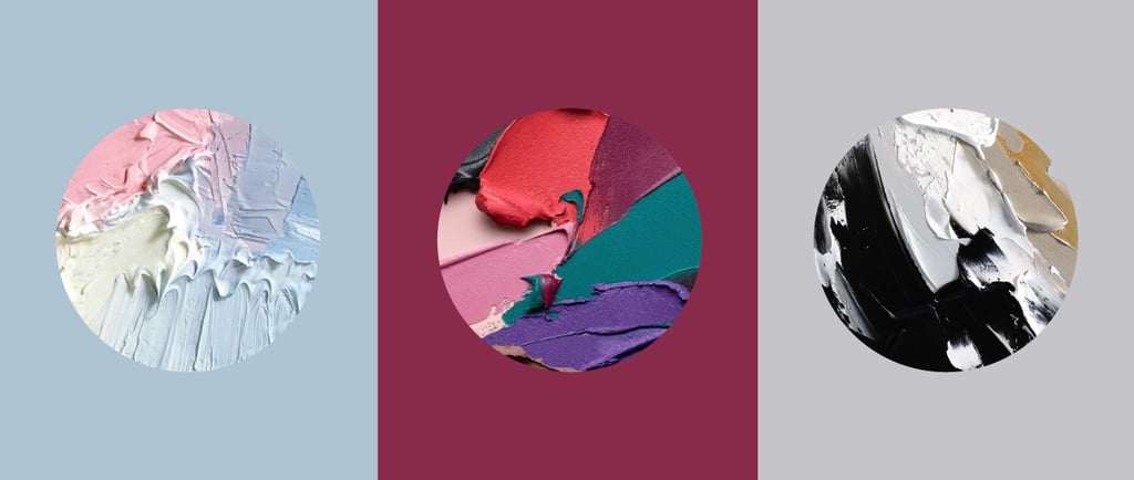
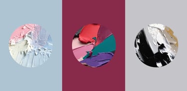
Is your brand playful and fun or sleek and professional? Understanding your brand’s personality will guide you toward colors that reflect its vibe. For example:
Soft pastels give off a friendly and inviting feel.
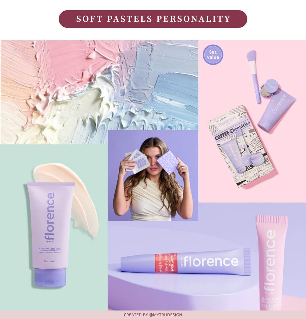
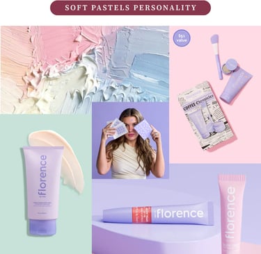
Have you heard of Florence by Mills? It’s the brand that immediately comes to mind when I think of pastel colors. Founded by Millie Bobby Brown in 2019, when she was just 15 years old, it made perfect sense for her to use this color palette, especially considering the audience she was speaking to, which was teenagers and young adults, when she launched it.
Now, let's take a look at a different color palette, one with bold, vibrant hues that bring energy and excitement.
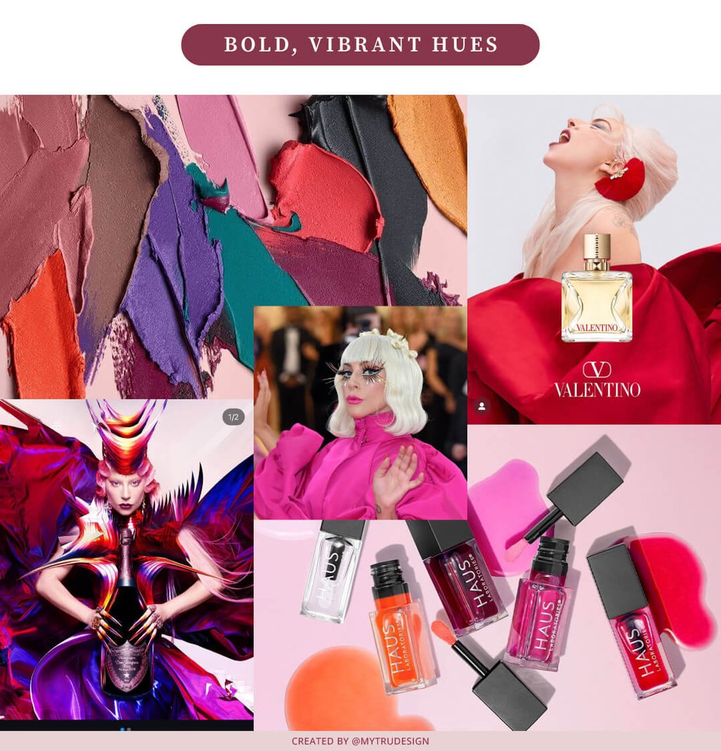
I mean, it's Lady Gaga. She's had several brand collaborations, but in each one, her personality shines through. She inserts her unique style into every product she collaborates on, and you can clearly see that in the image above.
Now, let's take a look at a color palette with minimal neutrals that convey sophistication and trust.
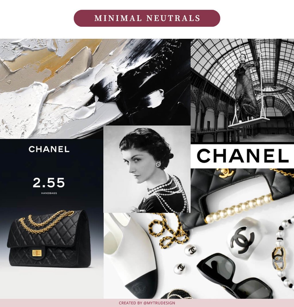
When you look at the collage above, doesn’t it communicate trust, elegance, and that luxury vibe? I know it’s Chanel, but the color palette plays a huge role in conveying that message. Coco Chanel, the brand’s founder, was famously fond of black and white, using these colors to create sophisticated and timeless designs.
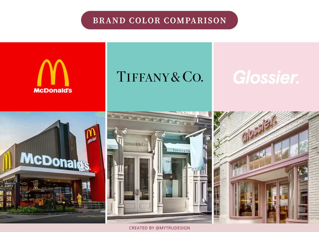
2. Consider Your Audience
Who are you trying to attract? Different colors appeal to different people. A youthful, creative brand might use bright, unconventional colors, while a luxury brand may lean into deep, rich tones. Here are some real-life examples:
McDonald’s: Uses bright reds and yellows to appeal to families and children, creating a sense of fun, energy, and urgency.
Tiffany & Co.:The signature Tiffany Blue exudes luxury, elegance, and exclusivity, making it instantly recognizable to high-end jewelry buyers.
Glossier: Soft pinks and neutrals create a modern, minimalist, and approachable aesthetic that resonates with young, beauty-conscious consumers.
3. Use the 60-30-10 Rule
A balanced color palette is key. This rule helps create harmony in your brand visuals and this is what it means:
60% primary color (the main brand color)
30% secondary color (a complementary hue)
10% accent color (a pop of contrast to draw attention)
Consistently using the same percentages across all your marketing materials helps you connect with your audience and strengthen your brand, whether it's on social media or in a physical store.
4. Test Before You Commit
This step is crucial, depending on your business type, because colors can appear differently on screens, in print, and against various backgrounds. Experiment with your color choices in different settings to see what feels right.
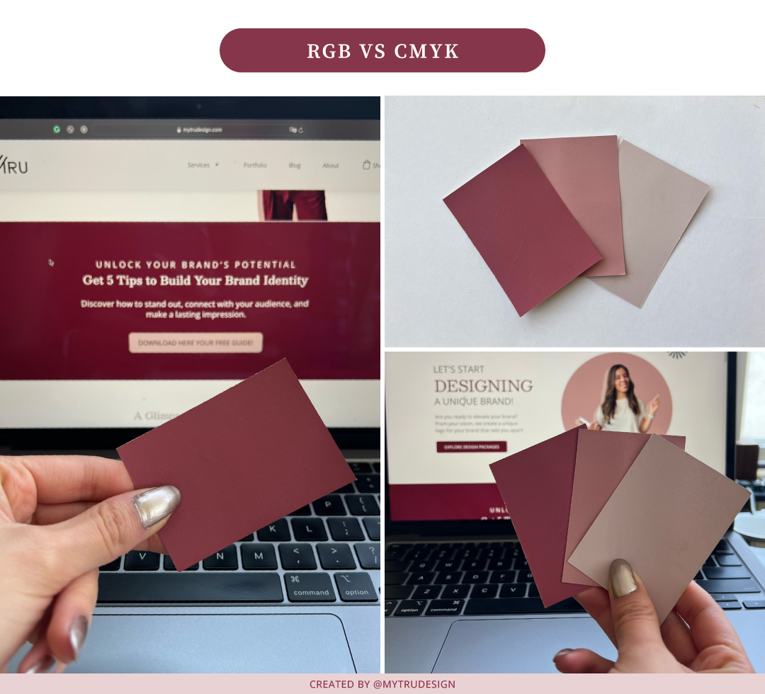
As you can see in this example, I experimented with these colors to see how my brand colors would look when printed on business cards. I wanted to ensure that the colors on screen closely match the printed version. This step is crucial, especially if your brand has a physical store, to ensure the colors work consistently in every setting.
Creating a stunning color palette doesn’t have to be overwhelming. Here, at Mytrudesign, I specialize in helping businesses like yours build beautiful, strategic brands that make a lasting impact. Let’s design a color palette that resonates with your audience and makes your brand shine! Contact me today and let’s get started.
Leave your comments below:
CONTACT
liz@mytrudesign.com
ADDRESS
Operating worldwide, based in Quito, Ecuador
© 2024–2026 Mytrudesign. All rights reserved.