5 Common Mistakes to Avoid When Selecting Your Brand's Color Palette
GRAPHIC DESIGN TIPS
Liz Trujillo
6/21/20244 min read

Let's talk about one of my favorite things to do, choosing the right color palette for your brand!
I know this can be a daunting task, with so many options, how can you possibly decide which ones are best for your brand?
As a graphic designer with years of experience, I've seen how the right colors can make a brand shine, and I've also seen how the wrong choices can lead to confusion and missed opportunities. To help you navigate this colorful journey, I’ve put together a list of five common mistakes to avoid when selecting your brand’s color palette. Let's get started and make sure your colors are a great ally for your business!
1. Ignoring the Psychology of Color
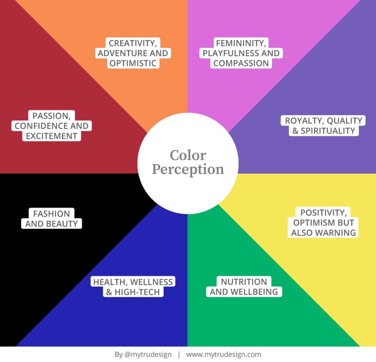
Colors evoke emotions and associations, playing a crucial role in how your brand is perceived. One common mistake is selecting colors based solely on personal preference rather than considering their psychological impact.
For example, blue often conveys trust, professionalism and health, while red can evoke excitement, passion, confidence and urgency. Each color has a meaning, which is why it's important to understand the emotions and messages you want your brand to communicate, ensuring that the color and your brand's message are aligned.
2. Lack of Contrast
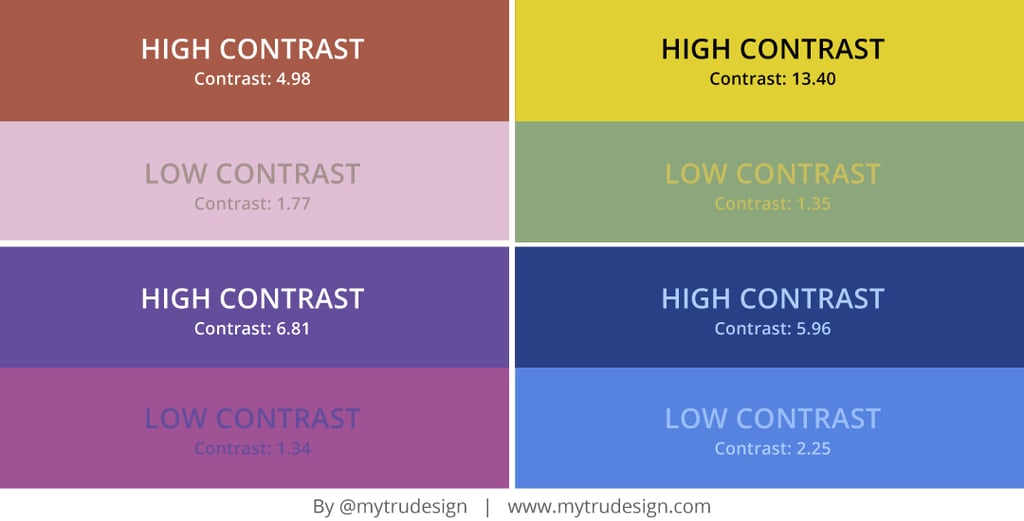
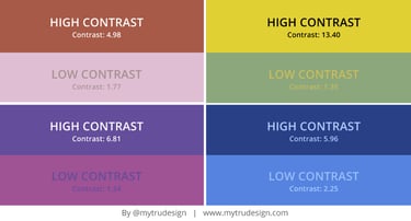
Another frequent mistake is not incorporating enough contrast in your color palette. This can lead to poor readability and a lack of visual interest. High contrast between text and background colors ensures that your content is accessible and easy to read.
Additionally, contrast can be used to draw attention to key elements and create a dynamic visual hierarchy.
Pro Tip: You can use tools like online contrast checkers to test the readability of your text against different backgrounds. My favorite tool for this is the Coolor's website. Just keep in mind to aim for a contrast ratio of at least 4.5. Here are some examples:
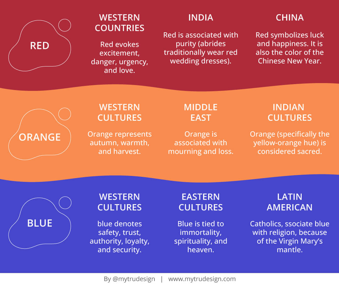
4. Disregarding cultural differences
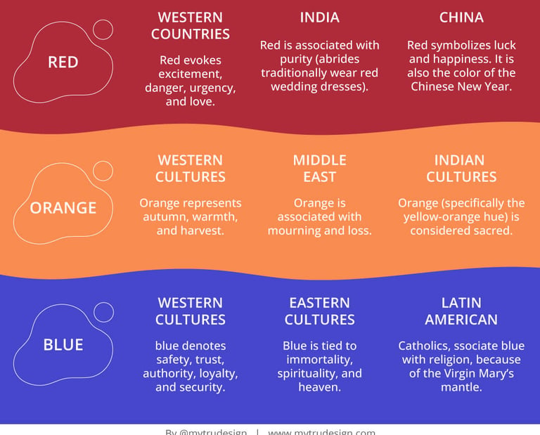
Colors can have different meanings in different cultures. A color that conveys a positive message in one culture might have a completely different or even negative connotation in another. Neglecting these cultural differences can lead to misinterpretations and alienate potential customers. Here are some example you can keep an eye on:
3. Over-complicating the Palette
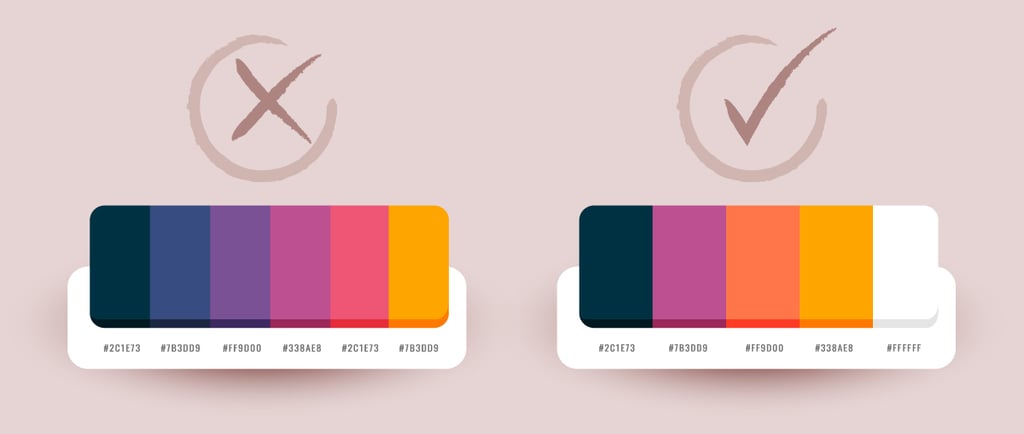
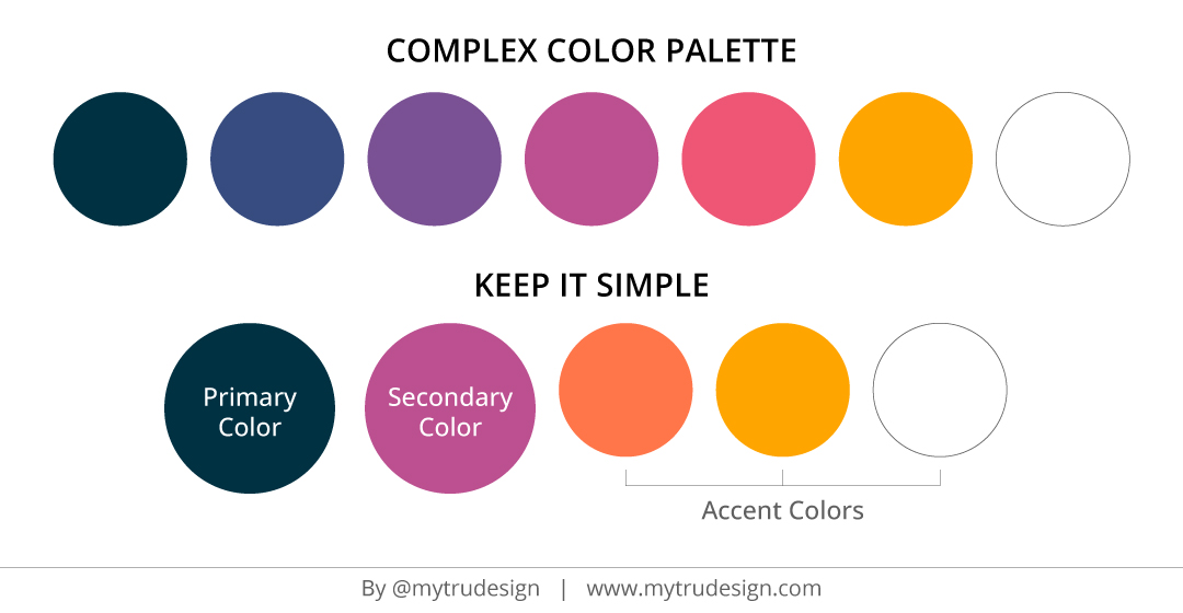
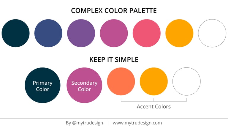
While it might be tempting to use a wide array of colors, a complex palette can be overwhelming and dilute your brand's identity. When you over complicate your color scheme you can generate inconsistencies and make it harder to maintain a cohesive look across different platforms and materials. A simpler palette ensures clarity and strengthens brand recognition.
Pro Tip: Stick to a primary color, a secondary color, and a few accent colors. Keep in mind to have a combination of colors that allows you to have a good contrast.
Pro Tip: Research the cultural significance of your chosen colors if you are targeting a global audience. In this article called Color Across Cultures you can find the meanings of more colors.
5. Inconsistency Across Different Platforms
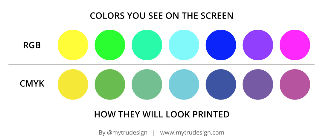
A common oversight is not considering how your color palette will appear across various mediums—print, digital, and physical products. Colors can look very different on a computer screen compared to printed materials, which can result in a lack of consistency in your brand's presentation. That is why you need to make sure your brand designer provides you with the color codes specific for each medium:
When colors are printed you tend to see a less saturated or glossy version on the paper. There are several materials in the industry that allow you to have almost 90% screen color match and your designer should be able to steer you in the right direction when it comes to handle bright colors.
Now let's look at an example of a brand being consistent with its color palette on the left side vs the same brand being inconsistent on the right side:

Doesn't it seem to you that on the image on the right, each screen shows different brands compared to the image on the left?
As you can see, selecting the right color palette is an important step in building a strong and memorable brand. By avoiding these 5 common mistakes and making informed, strategic choices, you can ensure that your brand’s colors resonate with your audience and effectively communicate your brand’s message. If you need expert guidance in creating a compelling color palette, feel free to reach out—I’d love to help you bring your vision to life! Just schedule a free consultation call. See you there!
Let's continue the conversation :)


CONTACT
liz@mytrudesign.com


ADDRESS
Operating worldwide, based in Quito, Ecuador
© 2024–2026 Mytrudesign. All rights reserved.
